
REDESIGNING THE PRAY WITH ST JOSEMARIA APP
Streamlining the mobile app’s user flow by automating two tasks and simplifying the interface to improve the user experience for its typically non-tech savvy target audience.


THE PROBLEM
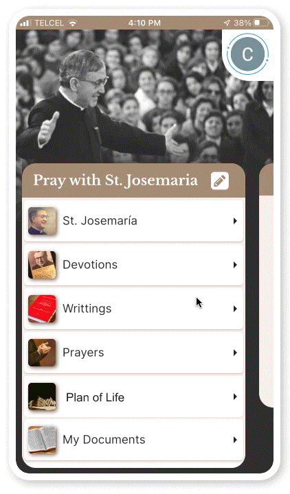
The Pray with St. Josemaria app is a subscription-based platform centered around its Plan of Life feature, offering users a strategy to track and enrich their faith through daily prayer goals. However, users don’t understand the app’s features and believe it looks outdated.
As the sole product designer, my primary objective was to enhance the Plan of Life’s intuitiveness by optimizing the user flow and enhancing its visual appeal. The goal is to motivate users and increase subscriber retention.
Client: Jorge Panayotti, Prayer App Developer
Duration: 3-week design project
Team: 1 Founder, 1 Developer, & 1 Product Designer
Methodologies: Interviews, Feature Prioritization, Wireframing, Rapid Prototyping, User Testing, Surveys
OVERVIEW

THE SOLUTION: CREATING A SIMPLER, MORE ENGAGING USER EXPERIENCE
VISUAL:
Create a more attractive color palette
Establish a design system for consistency
Enhance image quality and layout
USABILITY:
Simplify the app by removing unnecessary complexities
Adjust the information architecture to prioritize user needs
FEATURES:
Automate features to create less work for the user
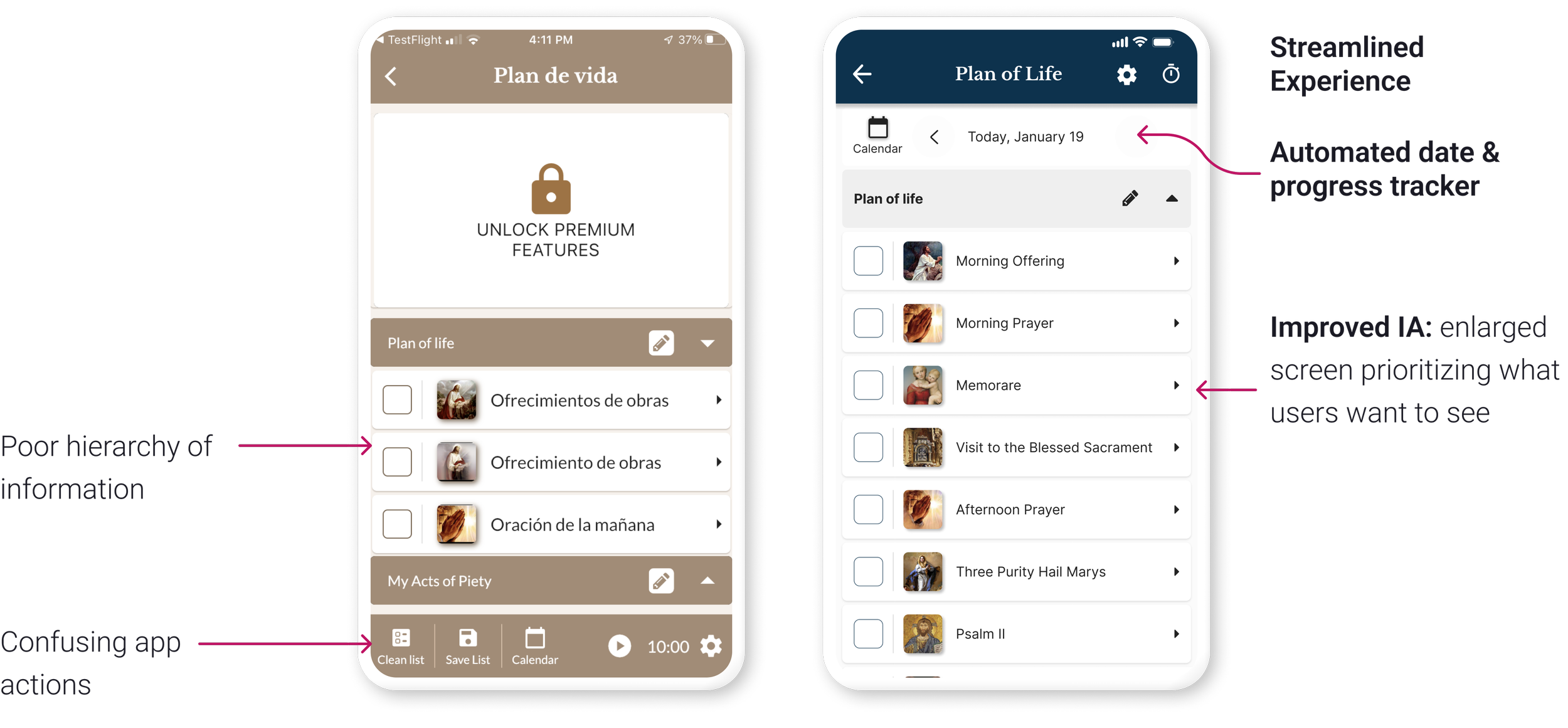
ORIGINAL VS PROPOSED DESIGN


OUR WINS: A SIMPLER, MORE INTUITIVE APP

Note: the app has not yet launched; success will continue to be measured by user feedback and subscriber retention after launching.
By programming the app to automatically track user progress and provide a daily clean prayer checklist, we were able to save users an average of 27 seconds each day and remove two confusing features ("clean list" and "save list").
These changes simplified the user flow and reduced confusion, making the app much more efficient and enjoyable to use.
ABOUT THE APP
The Pray with St. Josemaria app is an under development Christian prayer resource that offers books, writings, and prayers aiming to improve religious life. The new app is envisioned as an optimized version of the existing St. Josemaria app, which has ~35,000 users.
In my first chat with the founder, we looked at feedback from users and problems with the current app. Since the new app is similar, I thought it might have the same design issues. To check, I asked three users how they use the Plan of Life and what the icons mean. The results confirmed that the biggest pain point is that it's not intuitive.

WHAT USERS ARE LOOKING FOR
I interviewed three users and obtained survey feedback from three others. The goal was to uncover their likes and dislikes, how they use the app, and what they perceive to be the app’s unique value proposition. By collecting and analyzing this feedback, I was able to identify which features required prioritization and inform the design process.The findings are summarized into the following key takeaways:


EXPECTATION VS REALITY: A BREAKDOWN OF THE CURRENT EXPERIENCE
The Plan of Life’s expected daily user flow requires users to go through 4 steps to track their progress and generate a new list. In reality, I discovered through my user interviews that instead of saving the list and using the tool to uncheck all items, users tend to manually uncheck each item, finding this approach more intuitive.


Note: Insights into the app's usage were obtained from the existing St. Josemaria app's user base. As the new Plan of Life app has retained the same features and functions as the existing app, these insights are relevant to the new app.

SO, WHAT’S THE PROBLEM?
Simply put, the biggest issues with the Plan of Life’s usability are:
Users waste time unchecking their prayer lists on a daily basis
The features are confusing and users are unaware they exist
PROPOSED WIREFLOW: AUTOMATING MANUAL PROCESSES

TESTING THE CHANGES
After automating the calendar tracking feature and providing a daily clean slate, we discovered that users were no longer interested in the check/uncheck all tool. As a result, we eliminated the tool to simplify the app.

Note: Before conducting usability tests, I consulted the proposed changes with the app's founder and developer to ensure feasibility.
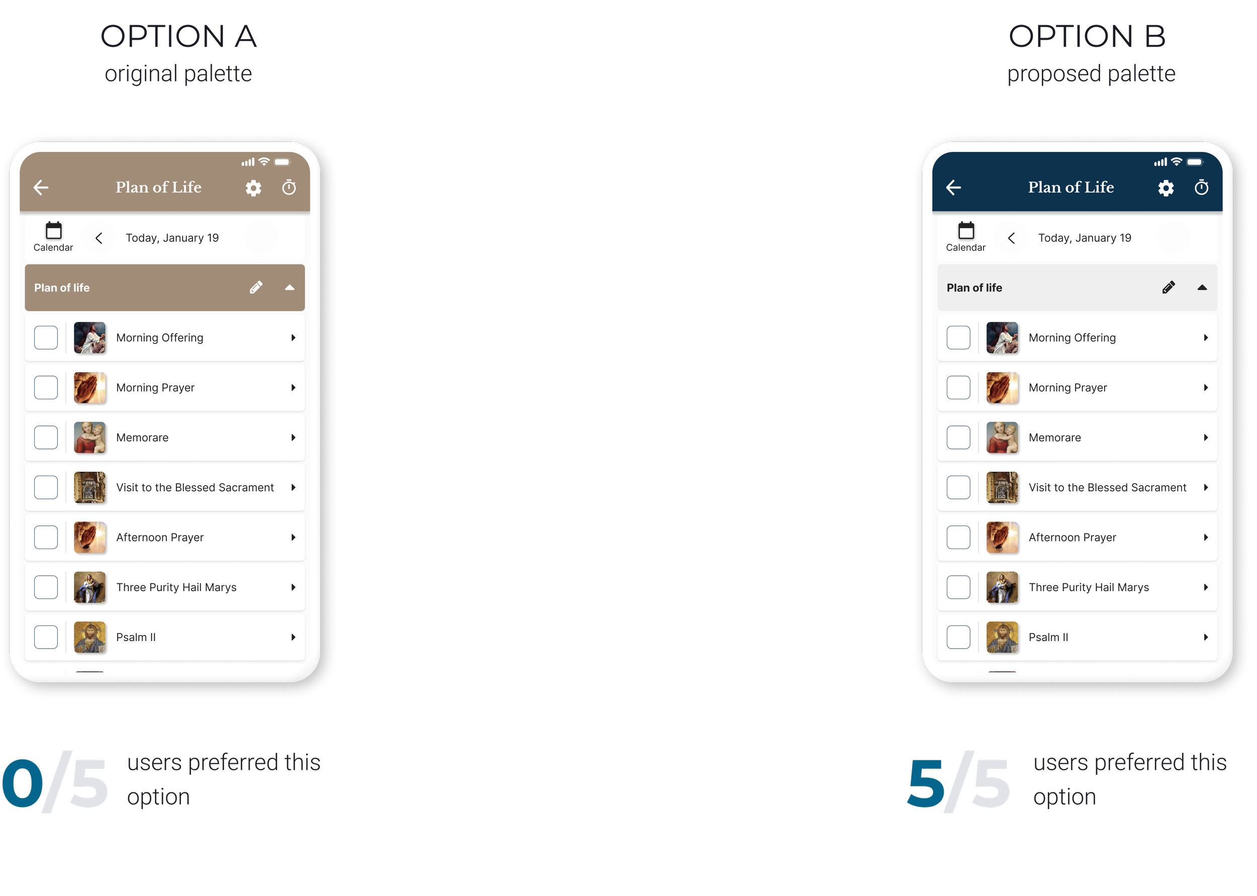
DESIGN FACE-OFF: TESTING TWO DESIGNS FOR IMPROVED UX
I found the feedback on the prayer card composition surprising, given that I had suggested option A as a potential improvement. The current prayer card had limited screen space, which required excessive scrolling, so I thought option A would help solve this issue.
However, when we presented both options A and B to users, 5 out of 7 responded that they preferred option B. This option displayed the image continuously, regardless of the amount of scrolling required.
Interestingly, the two users who preferred option A were between 30-35 years old, while those who selected option B were between 50-65 years old. The older group of users found the image helpful in increasing focus during prayer, which led me to wonder: is it a religious thing younger users are unaware of or is it an age aesthetic preference?


REFRESHING THE UI
When gathering feedback on the app's aesthetics, users expressed that it appeared dull. Initially, the app featured over 13 colors within a brown-beige palette.
To enhance its visual appeal and evoke a sense of calm, I suggested simplifying the palette to include shades of blue, white, and gray. When presented with the two color palette options to 5 users, all five preferred the blue palette.
PROPOSED UI

WHAT HAPPENS NEXT?
The insights collected in this case study served as the foundation for a design kickoff aimed at enhancing the app. As the app continues its development journey, targeting an anticipated release in early 2024, the following recommendations have been proposed for the app's development team:
Continue testing the proposed Plan of Life page
Fine-tune the timer’s settings and test it
Review other parts of the app’s design
CONCLUSIONS
It's been great working on this project as the first UX designer for the app, there has been a lot of learning involved.
The most exciting part: testing the two proposed design options and being surprised by the results
Setbacks: realizing the amount of time it can take for a developer to execute the proposed changes
What I look forward to: exploring and testing options to refresh the app’s look and make it more modern