
SOUTHWEST AIRLINES BAG TRACKER
Introducing a baggage tracking and digital claim feature on Southwest’s mobile site, giving passengers control to efficiently locate and recover their bags.


Southwest passengers are currently unable to track their bags and must report mishandled bags in person, frustrating an estimated 500,000 passengers annually and negatively impacting the airline's customer relationships.
As the lead interaction designer, I proposed a baggage tracking feature to help passengers seamlessly locate their belongings. I spearheaded the development of the mobile prototype, co-led user interviews, and was the main contributor to the final presentation’s structure and storytelling content.
Client: School Project for General Assembly (Southwest was not involved)
Duration: 2-week project; Fall 2022 Team: 4 Designers, 1 Project Manager
Tools: Figma, Maze, Canva, Trello
Methodologies: Interviews, Affinity Mapping, Feature Prioritization, Wireframing, Rapid Prototyping, User Testing, Competitive and Comparative Analysis
OVERVIEW
THE PROBLEM

THE SOLUTION: DIGITAL BAG TRACKING & CLAIM FEATURE
Real-time updates on baggage location
Actionable steps
Streamlines customer service procedures
Increases satisfaction, contributing to a positive perception of the airline.
ORIGINAL VS PROPOSED DESIGN: WHAT USERS SAID AND WHAT WE DID

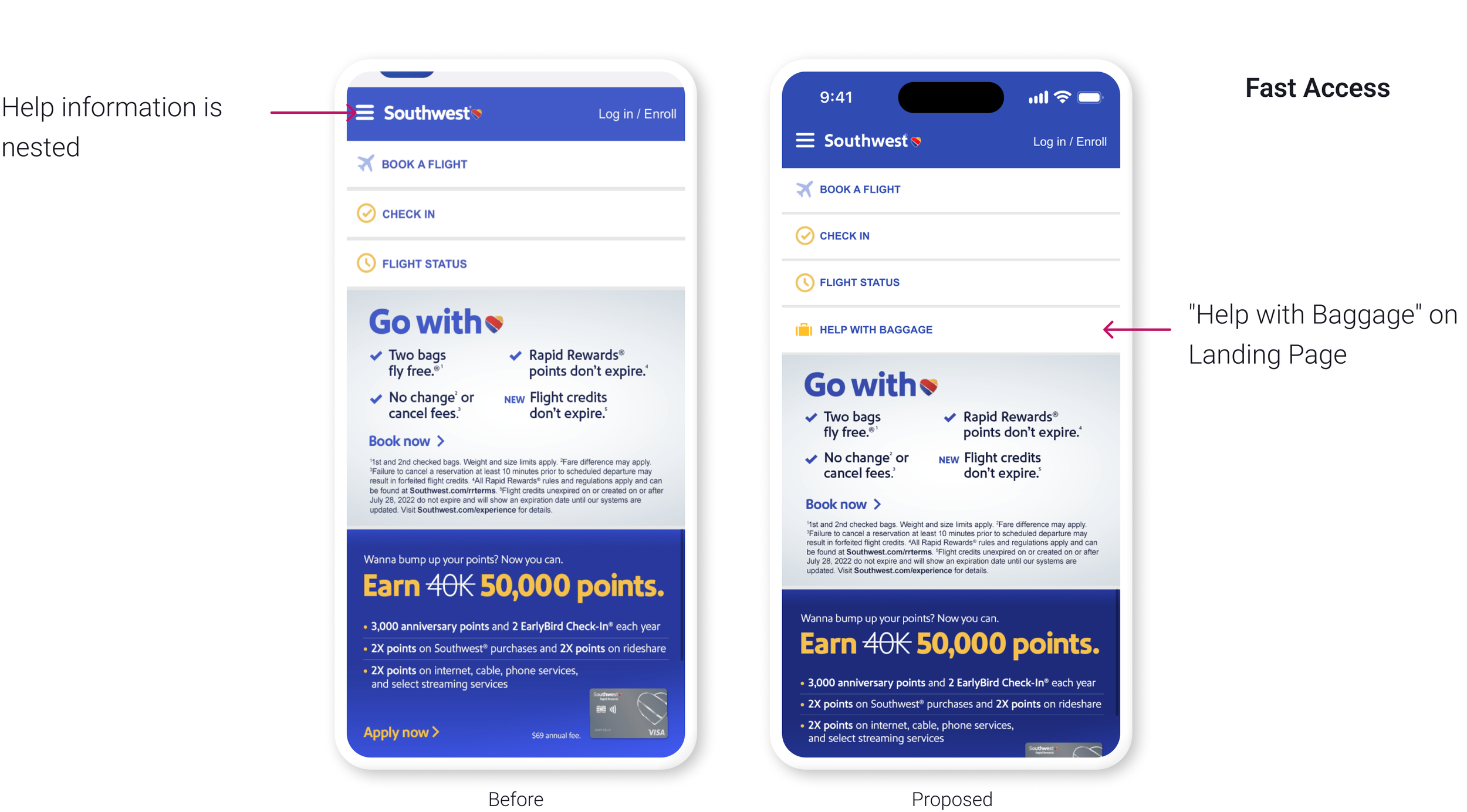


OUR WINS: INTUITIVE ACCESS TO BAGGAGE HELP
We first conducted 6 user tests on the existing online baggage help center and discovered it is confusing and hard to access.
Our proposed design, tested with 6 additional users, proved to be more intuitive and efficient, enabling frustrated passengers to get help quickly.
Note: as a speculative project, our metrics for success are based on user test improvements and positive feedback.
In a real world scenario, I’d like to conduct customer satisfaction surveys to compare the experience of passengers who report mishandled baggage in person versus those who use the proposed digital claim form..

ABOUT SOUTHWEST
Southwest Airlines is a low-cost US airline serving 121 airports in 11 countries. It aims to connect people through friendly, reliable air travel and is the leading airline for nonstop domestic US flights. Southwest announced they are investing in new technology for improved self-service capabilities.
Their target audience is typically young travelers and businessmen/women.
EMPATHY: WHAT WE LEARNED FROM USERS
Losing your baggage is a terrible experience. If you’re wondering what it feels like, this is it.

We interviewed 8 individuals who had experienced lost or delayed baggage to understand their coping strategies, satisfaction levels, and expectations. Using a journey map, we identified areas where we could intervene and improve the user experience.

COMPETITIVE & COMPARATIVE ANALYSIS
We found that all three competitors (Delta, American Airlines, and Turskish Airlines) offer mobile baggage tracking that allows users to locate their baggage using trip confirmation or bag tag numbers.
For the comparators, we noticed the three companies looked at (Uber Eats, USPS, and DHL) present clear and concise information about package location, ETA, and progress updates in an easy-to-understand format for users.
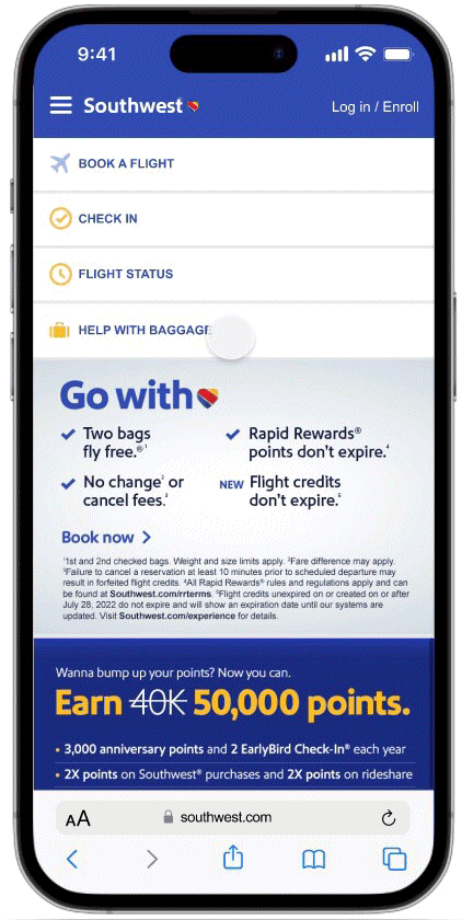
THE PROBLEMS WITH THE CURRENT SITE
Based on our usability tests of the existing site, we discovered the following:
The process of finding help is not intuitive
The relevant information is too deeply nested, which can be frustrating for someone in distress
There is no actionable item provided; users are asked to report issues in person

PROPOSED DESIGN WIREFLOW 1: TRACK BAGS
Our initial wireflow proposal aimed to address the following issues:
Improve the ease and intuitiveness of accessing baggage help information
Provide the ability to track bags
Offer an online actionable claim form

USER TESTS: BEFORE AND AFTER
We conducted usability tests on both the existing mobile site and the proposed design, with 6 users each, tasking them with finding information on making a lost baggage claim. As highlighted in “Our Wins”, the new design was found to be significantly more user-friendly. Below is an example of the issues encountered on the existing site compared to the proposed design.

ADDING TO THE PROCESS BASED ON USER FEEDBACK: CLAIM AND RECOVER BAGS
We found through user tests that while the proposed design was successful in terms of usability, it did not fully address all of the users' concerns. Specifically, users still desired more information on how they could recover their lost bags.


NEXT STEPS
As a two-week speculative project for General Assembly, we created a list of next steps to address if given more time. These include:
Testing copywriting to ensure users feel reassured and it aligns with Southwest's hospitality
Continue testing the design
Optimizing the UI design
Implementing our design on both the desktop website and app
Conducting a design studio on how to encourage travelers to adopt the new program
WHAT DID I LEARN FROM THIS?
As my first UX project with a team of designers, it was a fun and valuable learning experience. I learned the power of design studios, collaborative idea generation, and establishing clear goals and deliverables. Initially, we faced challenges with differing solutions, but we overcame this through objective voting using the MOSCOW method. Overall, it was great working with the team and learning from each other.
Shout-out to my amazing team Daniel Karp, Hetal Ajmeri, Karielle Moe, and Samantha Tan!